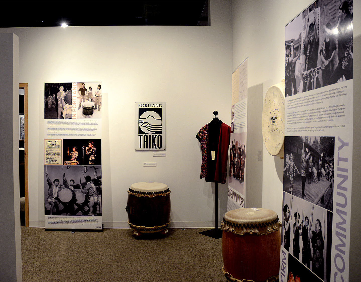
Portland Taiko 25th Anniversary Logo
Portland Taiko reached a milestone anniversary, and wanted a logo to promote the season‘s special events. The initial comps presented each showed a direction, variations, and applications.
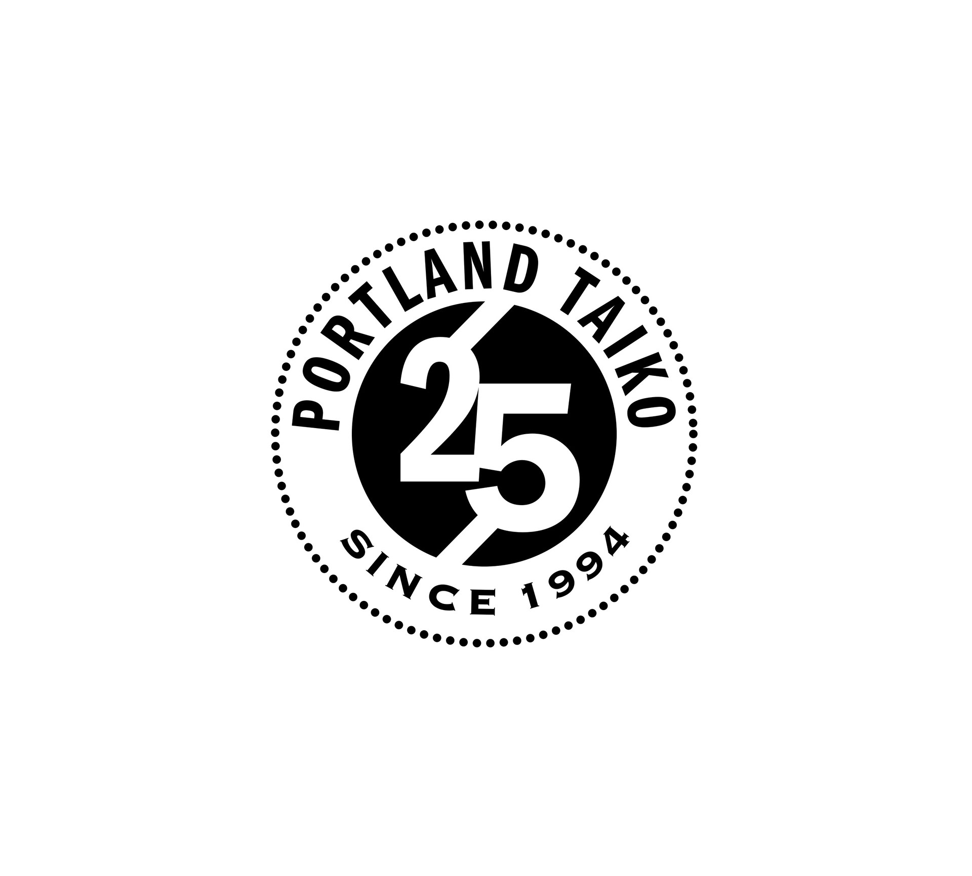
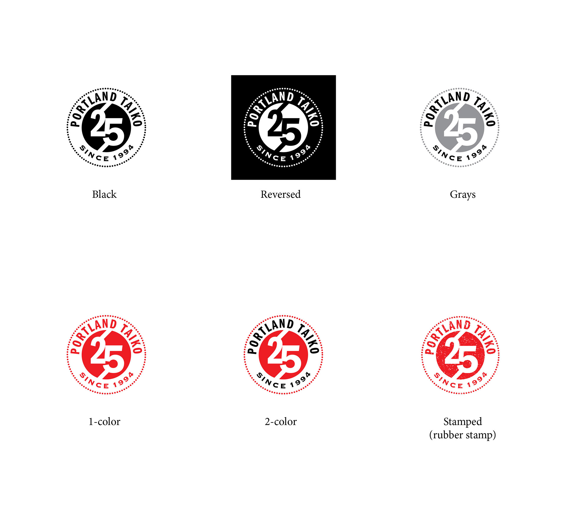
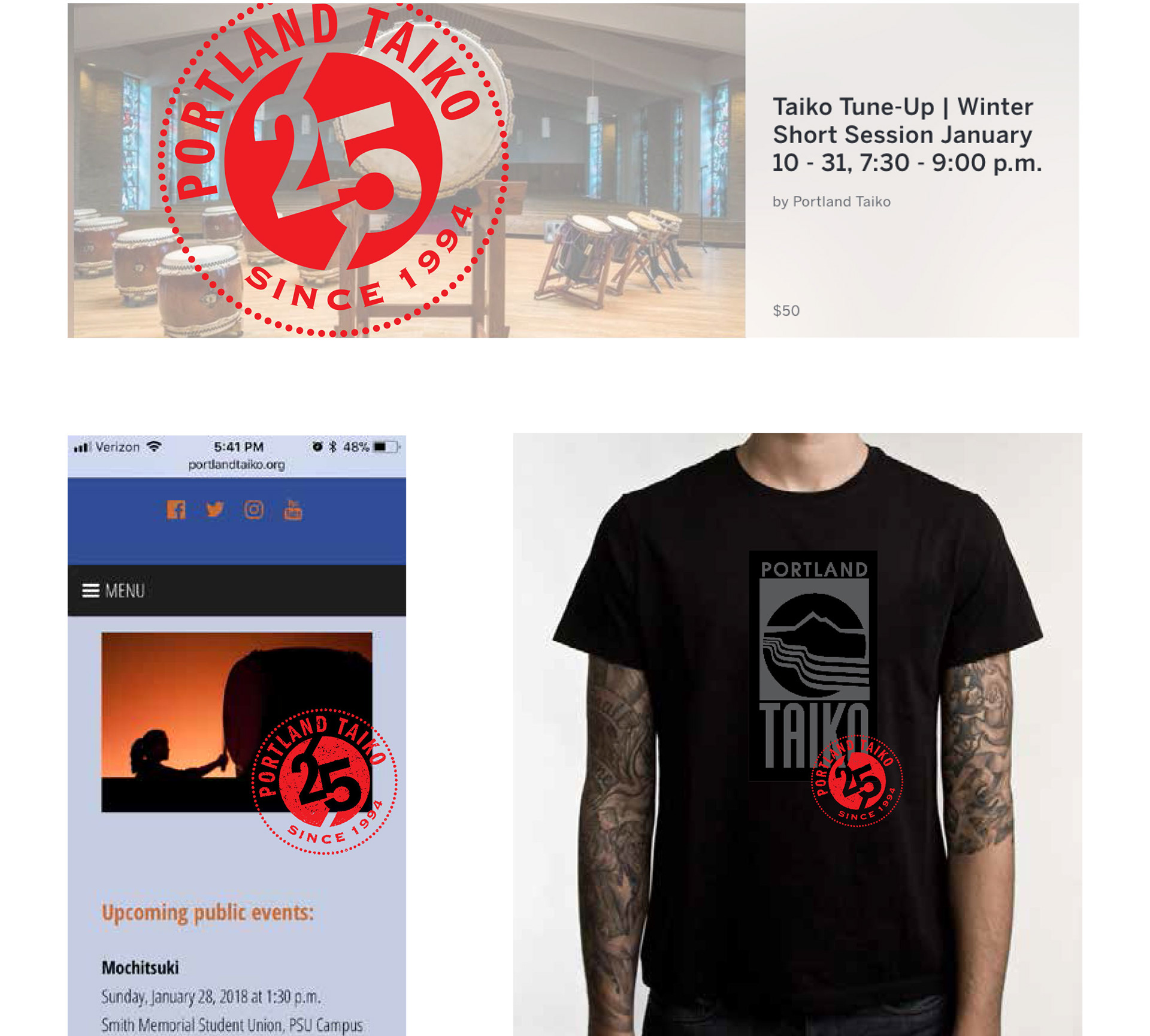
Option 1, below: this design references the structure of a taiko (drum), which is made with a hide stretched over a wooden frame, held in place by brads. The logo below is a stylized overhead view of a taiko, with the brads represented by the dotted outline, and the bachi (drumsticks) breaking the inner circle.
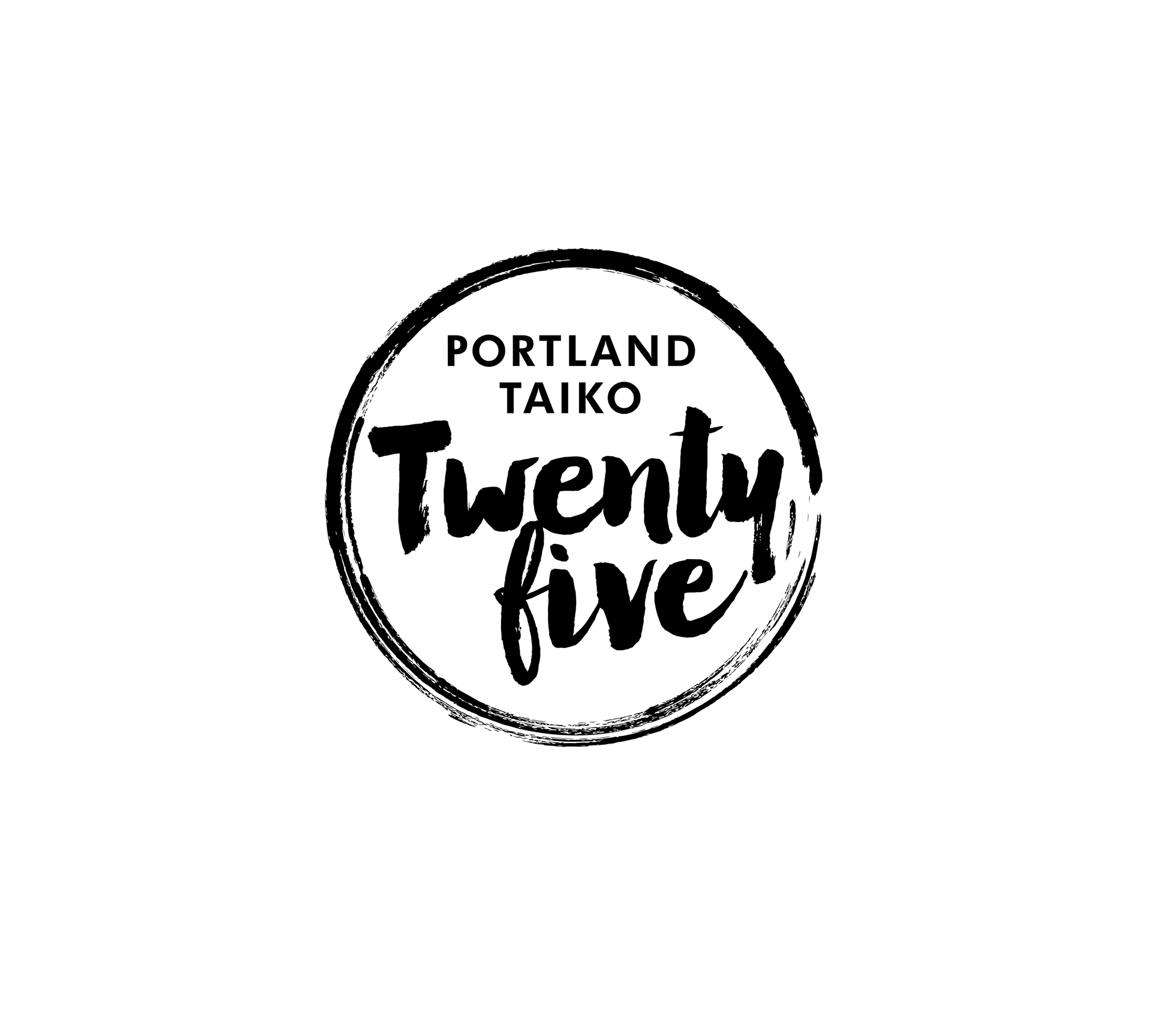
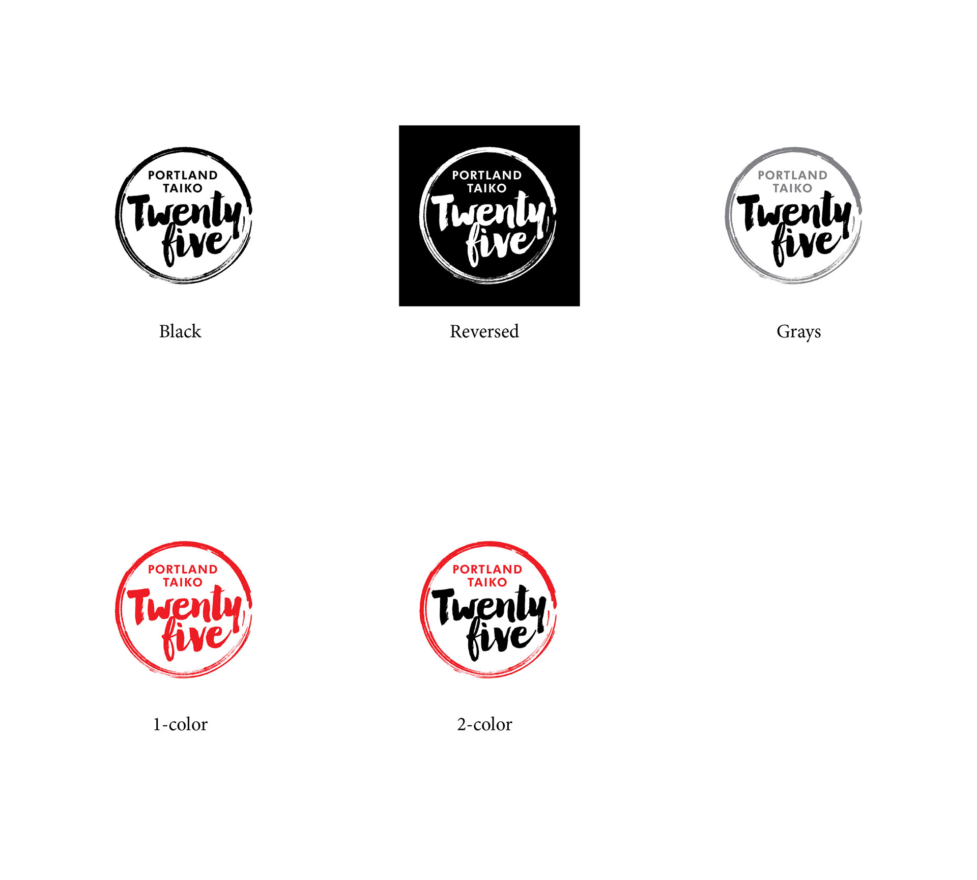
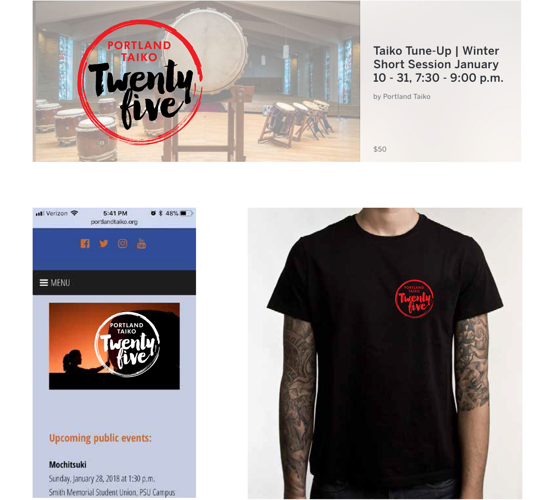
Option 2, below: due to the temporal nature and short-term use of the logo, the direction below combined the familiar ink-brush circle with a stylized script face to give it a look in keeping with the time period in which it would be used.
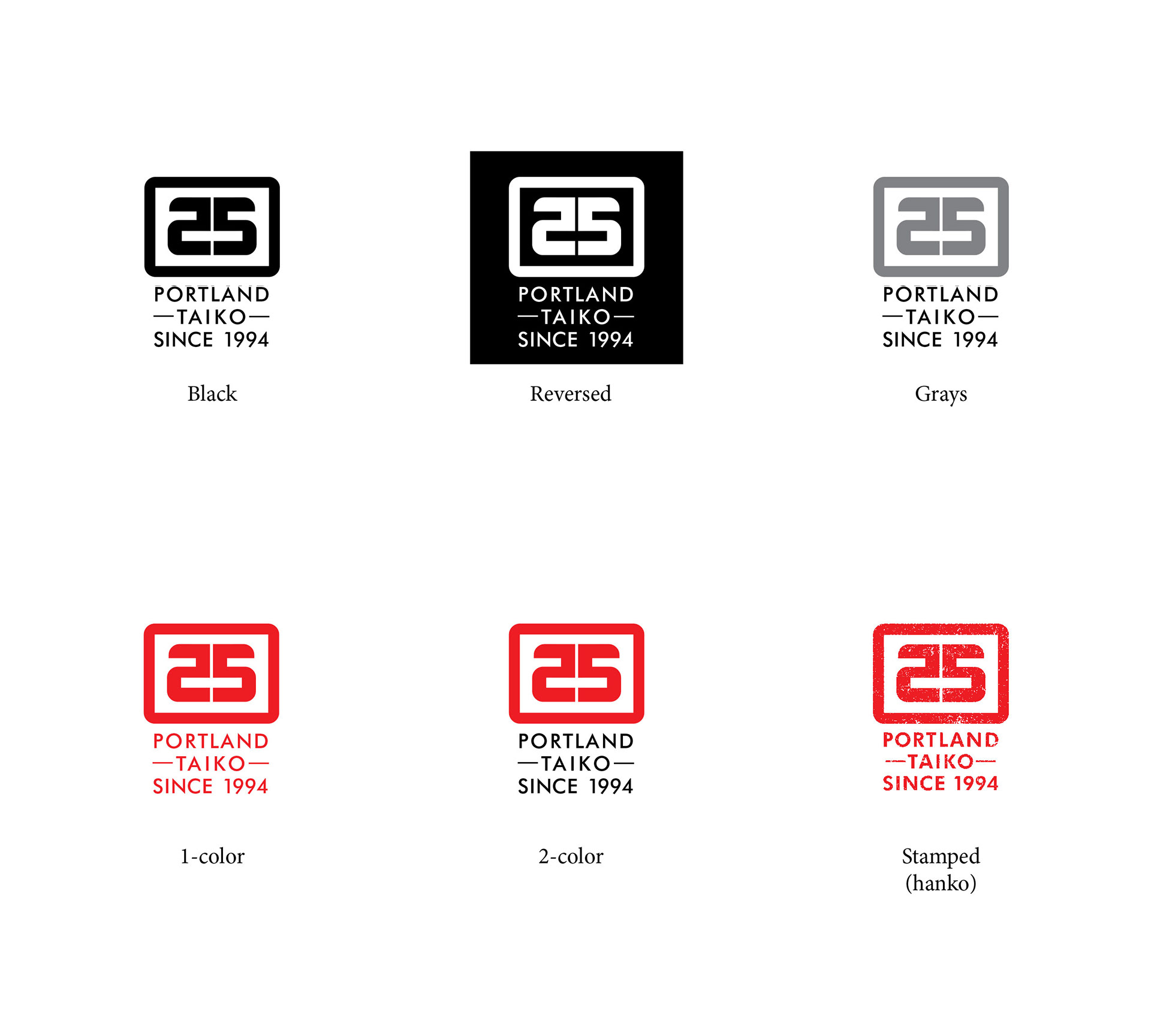
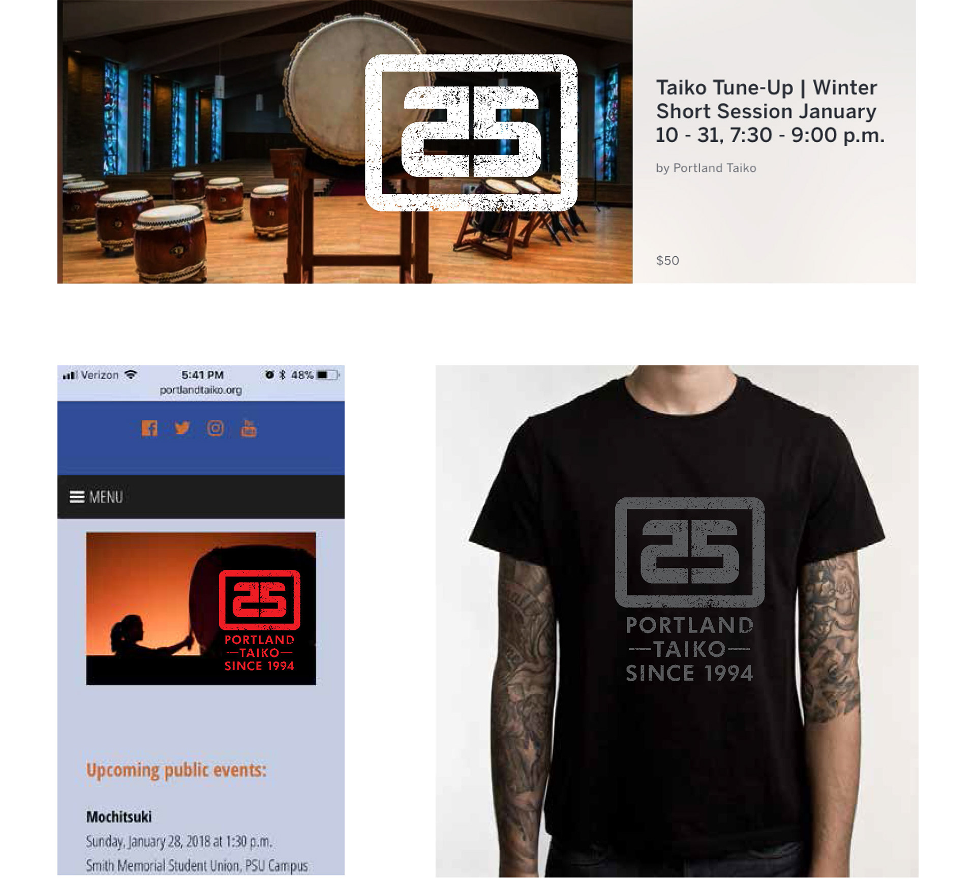
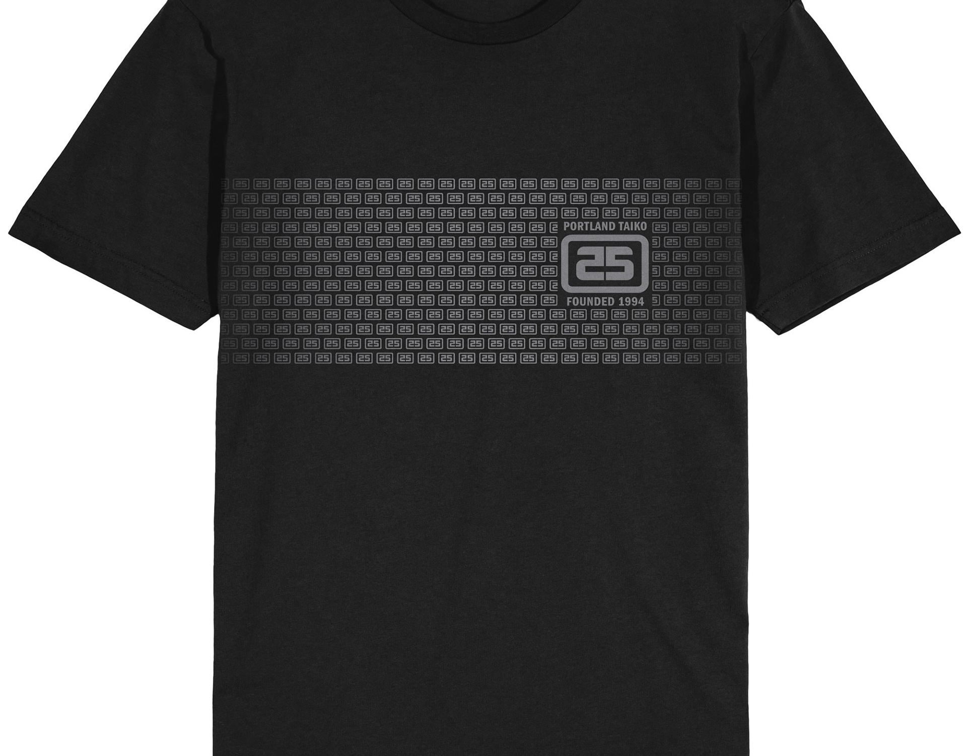
Option 3, below: the third initial approach altered the “2“ and ”5“ to be mirror images and placed them within a frame, reminiscent of a traditional Japanese lantern design, and also a chop (signature stamp). This was the chosen direction. Final logo and applications can be seen here.
