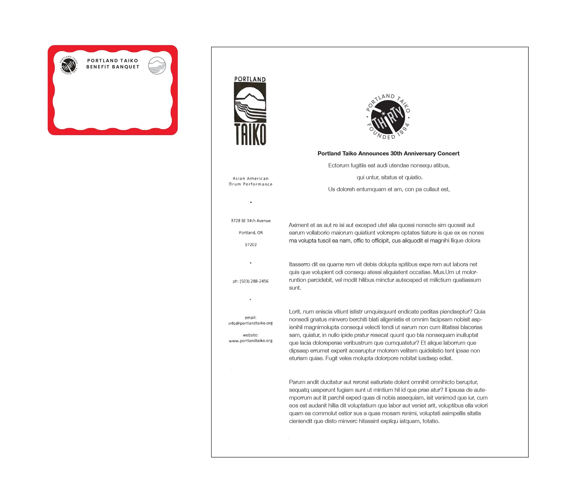
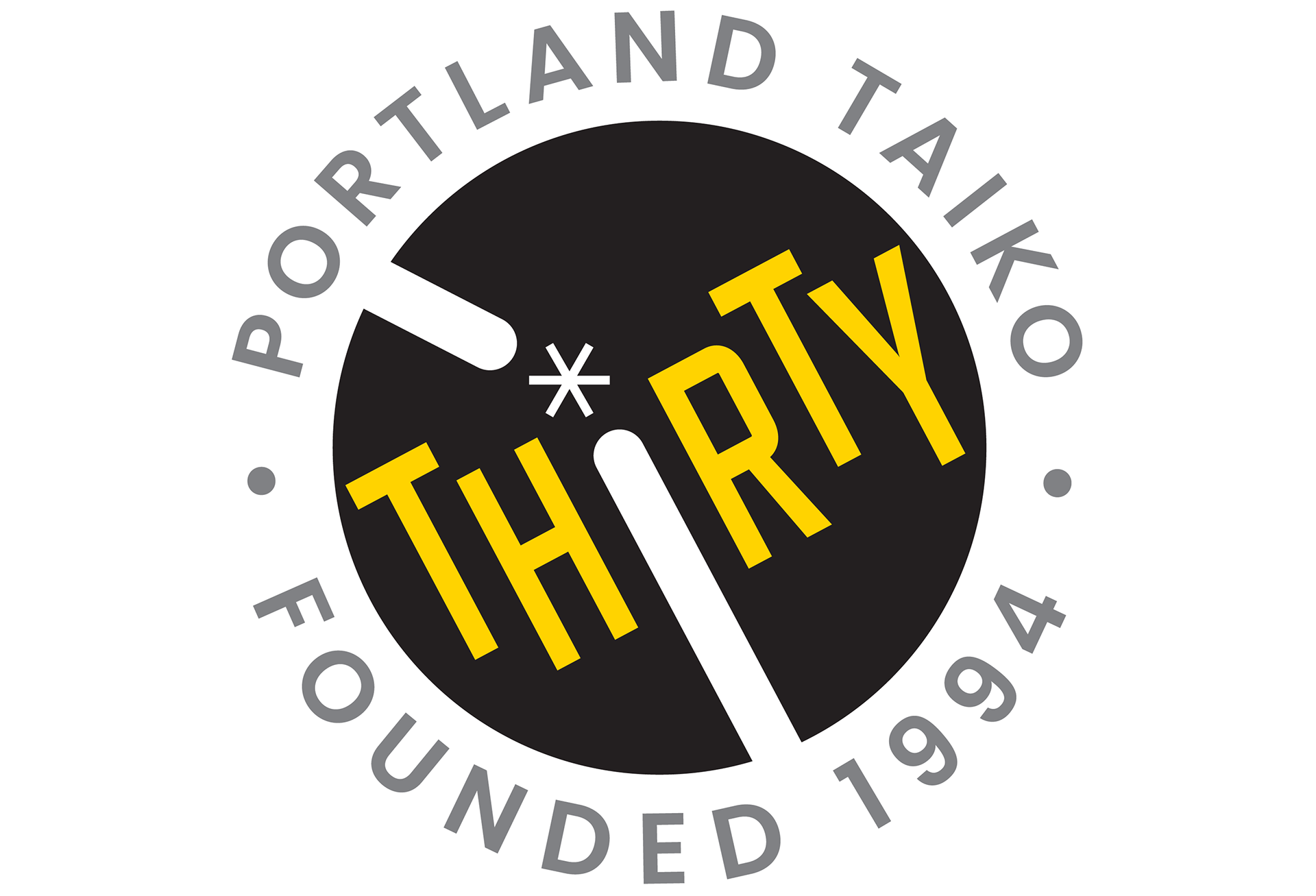
Portland Taiko 30th Anniversary Logo
When Portland Taiko celebrated their 30th anniversary in 2024, they wanted a logo to be used not only on their fall concert marketing, but also one they could use in-house to promote the anniversary all year.
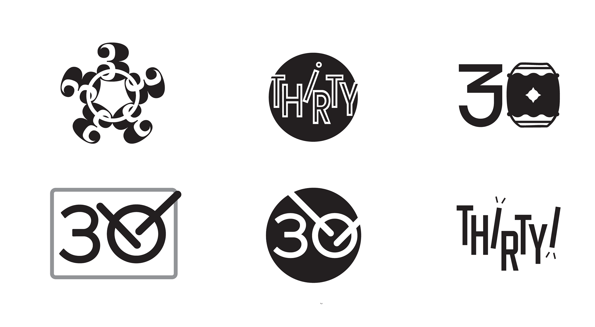
Some initial ideas played with typographic versions of 30 and THIRTY, along with the visual of a taiko and drumsticks.
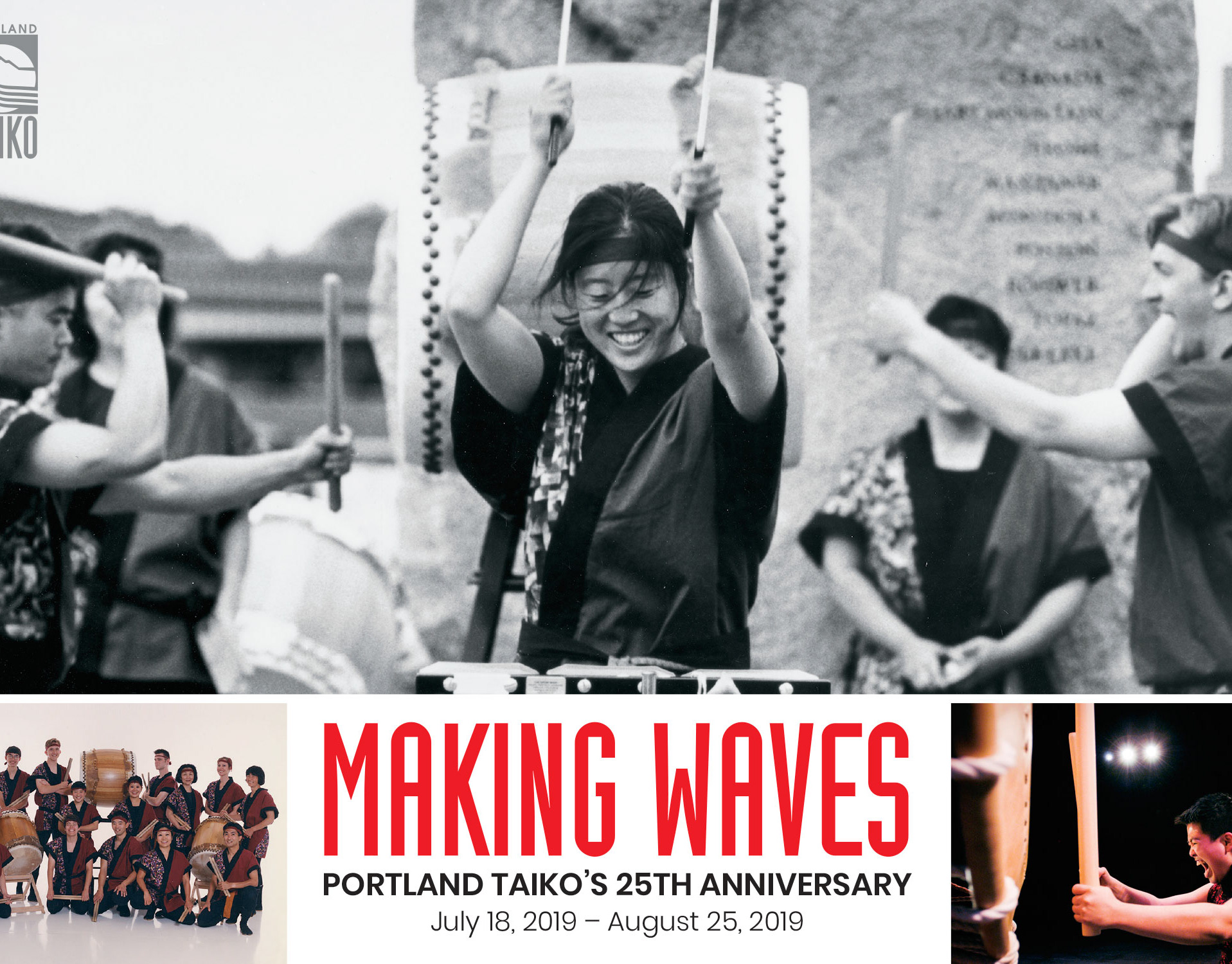
The next step was adding in the name and founding date to selected designs, and (after establishing the design worked as a black-only version) playing with the addition of color. The use of the rounded rectangle was a recall to the 25th anniversary logo.
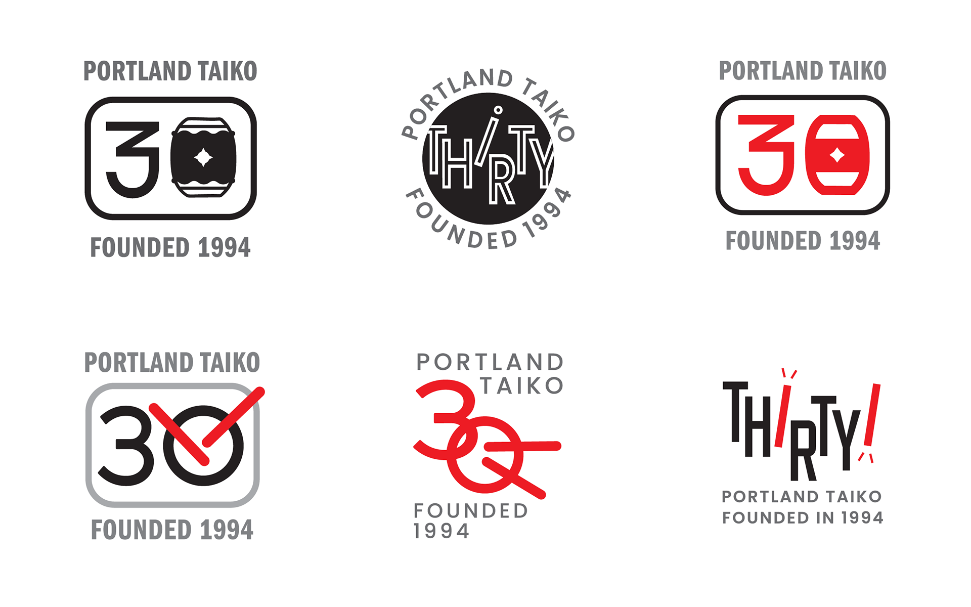
The final design combined elements of the drum head (the circle); drumsticks (with one serving as the letter “I” and the other as a counter element at the top); and the expression of sound (the star between the drumsticks which also serves as the dot in the letter “I”).
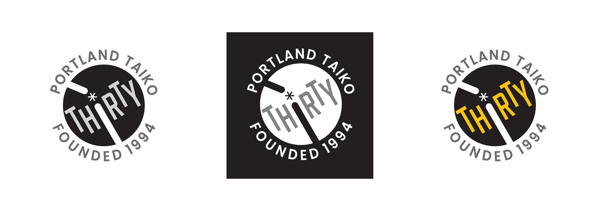
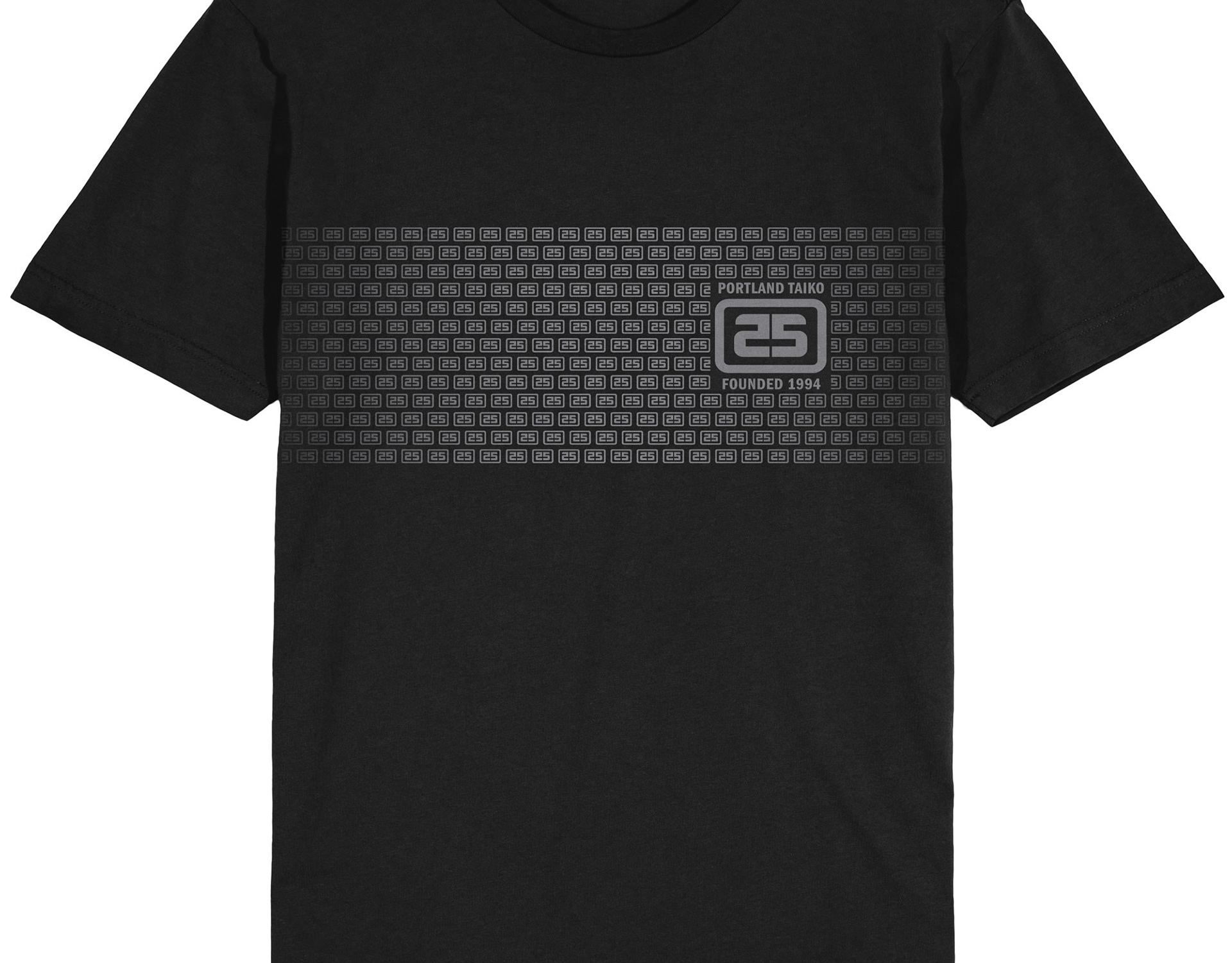
The final art was supplied to Portland Taiko as a monotone .png file with a transparent background; a round white round background; and a square white background. This allowed them to use it in-house on applications from name tags to social media profiles to merchandise.